Key details for this exam, checked against the published exam outline
Each question shows the correct answer and an explanation of why it is right
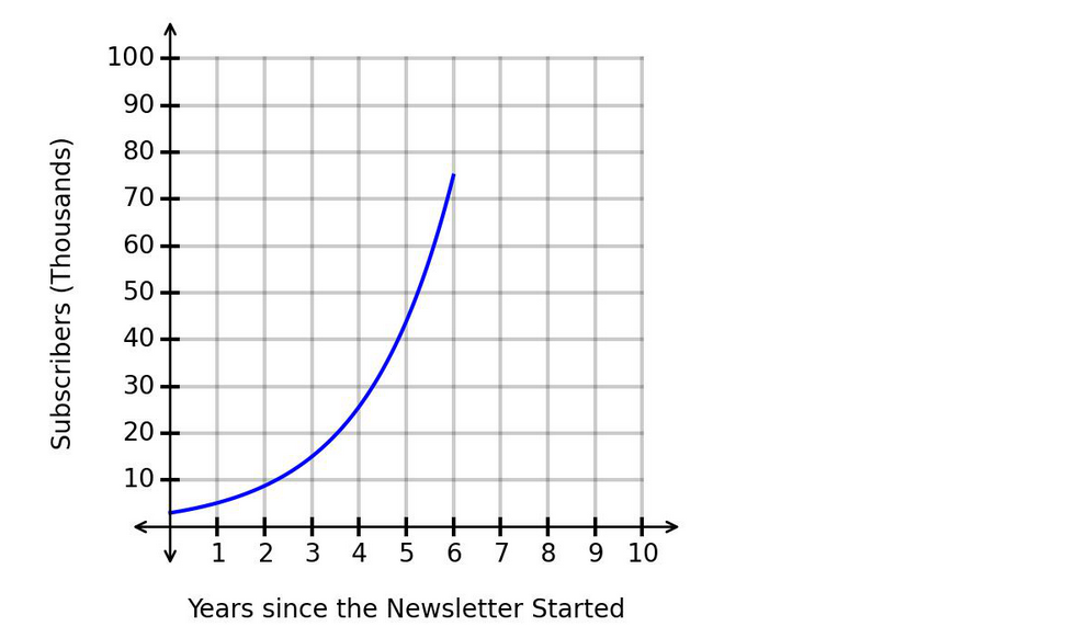
The function models the number of subscribers to a virtual newsletter over time. The graph of is shown. The horizontal axis represents the number of years since the newsletter started, and the vertical axis represents the number of subscribers, in thousands.
How is the number of subscribers changing over time based on the graph?
The graph shows an increasing exponential curve.
The number of subscribers is going up as time passes, so the function is increasing.
Also, the graph becomes steeper as time increases. This means the rate of increase is getting larger.
So the number of subscribers is:
This is a key feature of exponential growth.
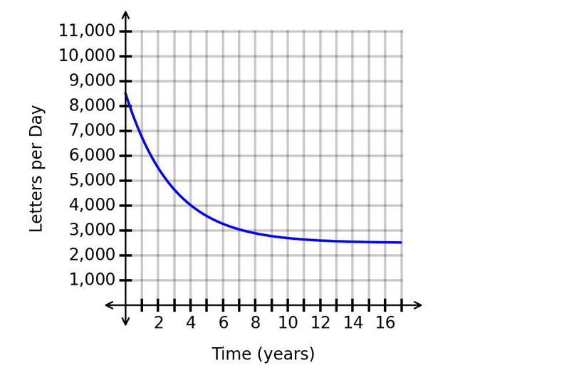
The number of letters processed daily at a mail center is modeled by the decreasing exponential function shown in the graph.
Which value is the number of letters processed per day trending toward as time progresses, based on the equation of the horizontal asymptote?
The graph shows a decreasing exponential function.
The vertical axis represents:
The horizontal axis represents:
For an exponential decay graph, the value decreases quickly at first and then begins to level off. The value it approaches in the long run is called the horizontal asymptote.
From the graph, the curve levels off near:
So the number of letters processed per day is trending toward:
This does not mean the mail center immediately processes exactly 2,500 letters per day. It means that as time continues, the number gets closer and closer to 2,500.
Therefore, the correct answer is:
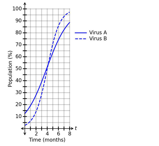
The spread of two viruses within a single population is modeled using the functions in the graph.
What is a correct conclusion based on the graph?
The graph compares the spread of two viruses over time.
The horizontal axis represents:
The vertical axis represents:
The graph shows:
Virus A as the solid blue curve.
Virus B as the dashed blue curve.
To determine which statement is correct, compare when each virus reaches the same population percentage.
At , Virus A reaches that level earlier than Virus B. The solid curve is already at before the dashed curve reaches .
However, for higher percentages like and , Virus B reaches those levels before Virus A because the dashed curve becomes steeper and rises above the solid curve after about .
So the correct conclusion is:
Therefore, the correct answer is:
The graph shows the number of people waiting in a virtual queue to buy tickets for an event.
What does the horizontal asymptote mean?
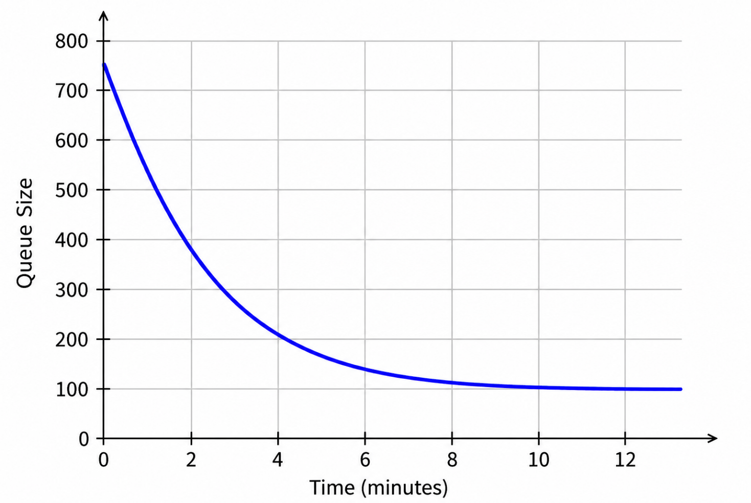
The graph shows the queue size changing over time.
The horizontal axis represents:
The vertical axis represents:
The graph is a decreasing exponential curve. It starts near people and decreases quickly at first. Then the curve begins to flatten near:
A horizontal asymptote is the horizontal line that the graph approaches as time continues.
Here, the graph approaches the horizontal line:
This means that as time passes, the number of people in the virtual queue gets closer and closer to .
It does not mean the queue decreases to , because the graph levels off near , not near .
Therefore, the correct interpretation is:
The value of a painting is represented by the function
In this function, xrepresents the number of years since 2004, and f(x)represents the value of the painting in dollars.
Which value represents the average yearly rate of change of the painting's value from 2013 to 2018?
Since represents the number of years since 2004:
so:
Also:
so:
The average yearly rate of change from 2013 to 2018 is:
Now evaluate the function:
Now calculate the average rate of change:
So the painting's value increased by an average of about:
Therefore, the correct answer is:
A new company just launched and is using the function to predict its market share after years. The graph of is shown.
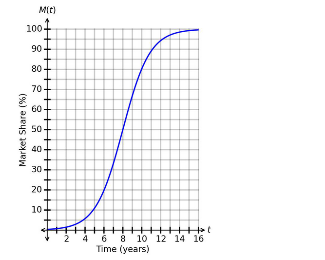
When should the company expect to have a market share of ?
The function represents the company's market share after years.
The horizontal axis represents:
The vertical axis represents:
We need to find when the market share reaches:
From the graph, locate on the vertical axis. Then move horizontally to the blue curve and read the corresponding value on the horizontal axis.
The curve reaches at approximately:
So the company should expect to have a market share of after about:
Therefore, the correct answer is:
5 domains from the WGU Applied-Algebra exam outline, with approximate weightings. Every sample question above is tagged with the domain it comes from
Simplify expressions using order of operations and like terms. Apply properties such as distributive, associative, and commutative. Evaluate expressions for given variable values.
Solve single-variable linear equations step by step. Work with inequalities and represent solutions on number lines. Translate word problems into equations and solve them.
Understand function notation and evaluate functions. Graph linear equations on the coordinate plane. Interpret slope and intercepts in real-world context.
Solve systems using substitution and elimination methods. Interpret solutions graphically and algebraically. Apply systems to real-life problem scenarios.
Apply exponent rules to simplify expressions. Add, subtract, and multiply polynomials. Factor basic polynomial expressions.
Common questions about the exam itself

