At ValidExamDumps, we consistently monitor updates to the Tableau TDS-C01 exam questions by Tableau. Whenever our team identifies changes in the exam questions,exam objectives, exam focus areas or in exam requirements, We immediately update our exam questions for both PDF and online practice exams. This commitment ensures our customers always have access to the most current and accurate questions. By preparing with these actual questions, our customers can successfully pass the Tableau Desktop Specialist exam on their first attempt without needing additional materials or study guides.
Other certification materials providers often include outdated or removed questions by Tableau in their Tableau TDS-C01 exam. These outdated questions lead to customers failing their Tableau Desktop Specialist exam. In contrast, we ensure our questions bank includes only precise and up-to-date questions, guaranteeing their presence in your actual exam. Our main priority is your success in the Tableau TDS-C01 exam, not profiting from selling obsolete exam questions in PDF or Online Practice Test.
Which statement accurately describes creating a group by selecting headers in a view?
When creating a group by selecting headers in a Tableau view, the newly created grouped dimension replaces the original dimension field on either the Rows or Columns shelf. This grouping action aggregates the selected headers into a single group, and this new group dimension is automatically placed in the view, replacing the original dimension. This functionality allows for more simplified and customized categorization within the data visualization, enhancing the ability to analyze and interpret data according to specific groupings.
Using the dataset, plot a Map showing all the countries, filtered by Market to only include LATAM. Which country in the LATAM Market has the highest shipping delay (sum of total number of days between the order date and the ship date)?
VERY IMPORTANT QUESTION FOR THE EXAM, PAY ATTENTION
1) To find the number of days between order date and shipping date, we will make use of a calculated field:
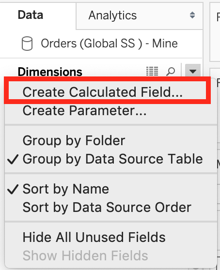
In the data pane, click on the dropdown arrow, and choose create calculated field.
Let's name this calculated field 'ShippingDelay' (you can name it anything you want :) )
2) Use the DATEDIFF() function, and pass it the arguments as follows:
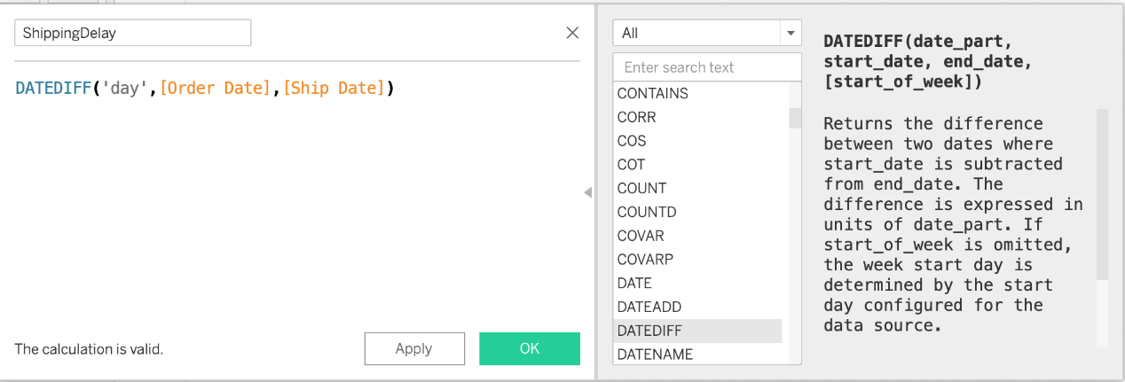
'day' depicts that we want to calculate the number of DAYS between the two dates. The first argument is 'start_date' which is the ORDER_DATE (day the order was placed), the second argument is 'end_date', which is the SHIP_DATE (date the order was shipped). So by subtracting as follows: SHIP_DATE - ORDER_DATE, we can find the delay in shipping.
Click OK.
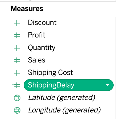
3) You should now have a new measure as follows:
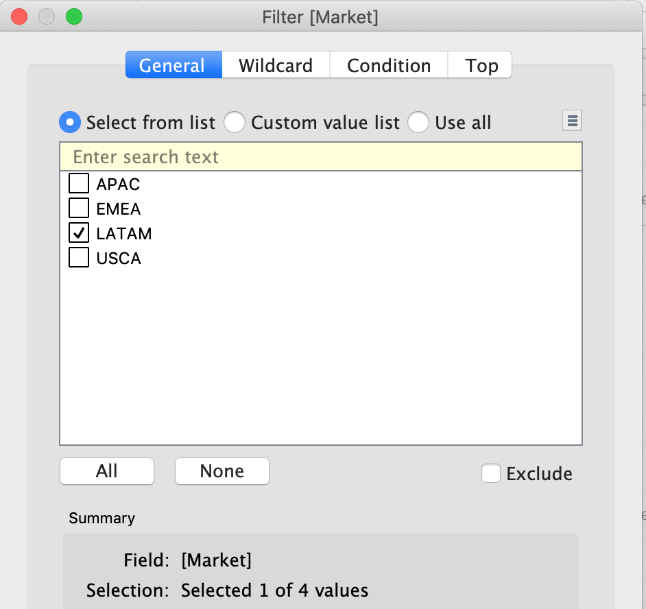
4) Phew! The hard part is done! Now let's filter by Market to include only LATAM:
5) Drag Country to the view, and the new calculated field 'ShippingDelay' to SIZE on the Marks Shelf as follows:
*You can also click on Show Text Labels to be sure that you're choosing the Largest value*
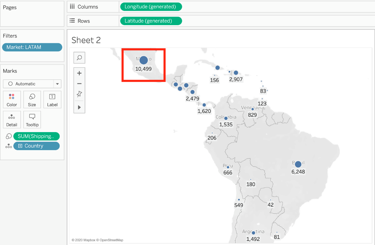
Clearly, Mexico has the highest Shipping Delay!
DOWNLOAD THE DATASET FROM - https://drive.google.com/file/d/1F8L_Rl5B9LAz8RDi-DdjWx3Iv-SgzaBq/view?usp=sharing ( if you haven't already from the test instructions page! )
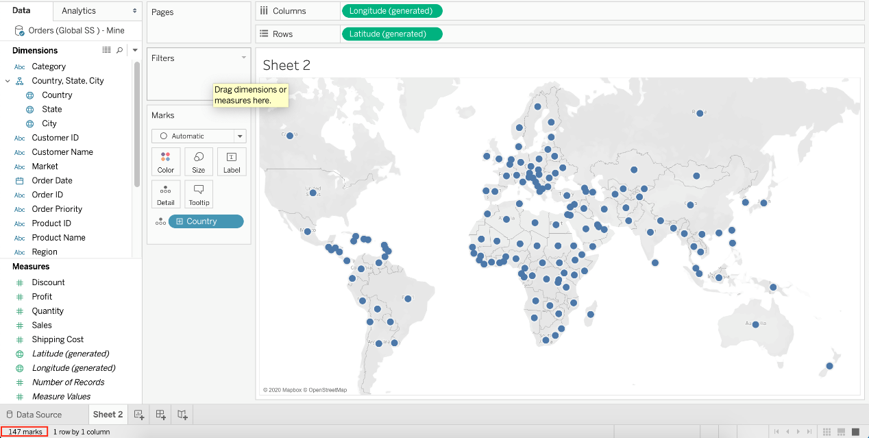
How many different countries are present in the dataset?
To reach the correct answer, follow these steps:
1) You can simply drag Country to the view, and look at the marks in the bottom left of Tableau Desktop - 147 marks!
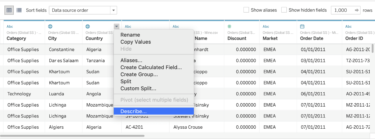
2) Or, you can simply go to Data Source -> Country Tab -> Describe
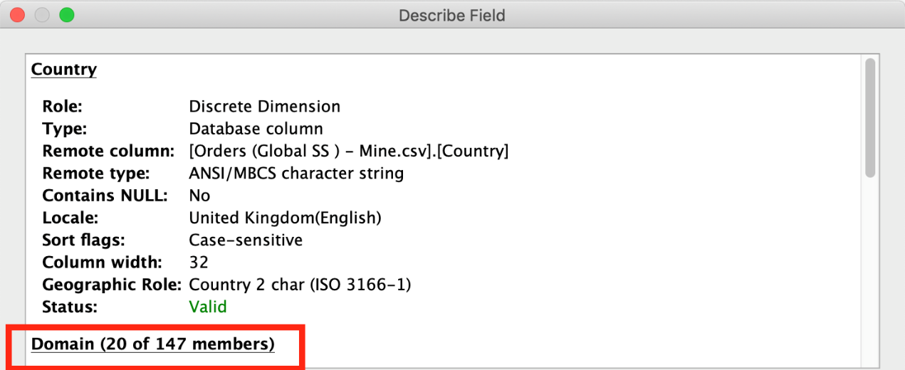
As you can see, 147 members exist in this Country column!
Which of the following is true about 'Incremental refresh' when creating Extracts in Tableau?
Extracts are saved subsets of data that you can use to improve performance or to take advantage of Tableau functionality not available or supported in your original data. When you create an extract of your data, you can reduce the total amount of data by using filters and configuring other limits. After you create an extract, you can refresh it with data from the original data.
When refreshing the data, you have the option to either do a full refresh, which replaces all of the contents in the extract, or you can do an incremental refresh, which only adds rows that are new since the previous refresh.
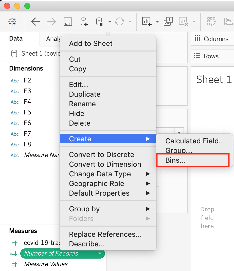
True or False : Bins can be created on dimensions
Bin are a user-defined grouping of numerical data in the data source.
According to the official Tableau documentation: It's sometimes useful to convert a continuous measure (or a numeric dimension) into bins.
Have a look at the following image. When we right click a measure, we get the following options:
However, for a dimension (this is because theDATA TYPEof this dimension is a string:
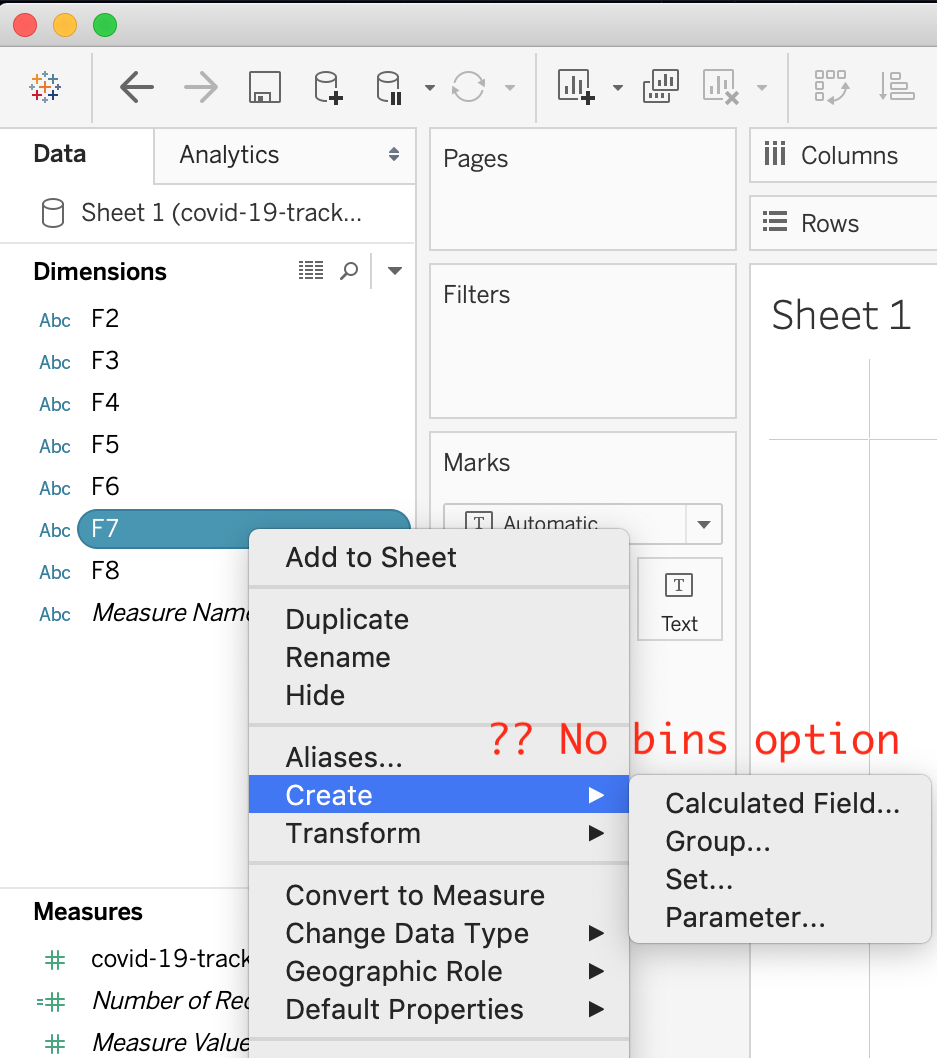
But what if we have a dimension of typeNUMBER (NUMERIC DIMENSION)? See below:
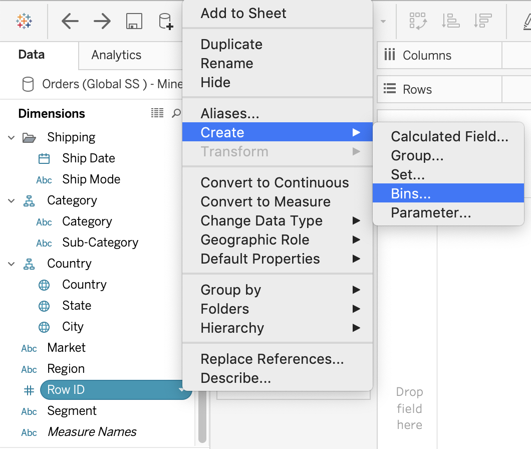
We can clearly create bins from dimensions too - they just have to be numeric :)