At ValidExamDumps, we consistently monitor updates to the Tableau TCC-C01 exam questions by Tableau. Whenever our team identifies changes in the exam questions,exam objectives, exam focus areas or in exam requirements, We immediately update our exam questions for both PDF and online practice exams. This commitment ensures our customers always have access to the most current and accurate questions. By preparing with these actual questions, our customers can successfully pass the Tableau Certified Consultant Exam exam on their first attempt without needing additional materials or study guides.
Other certification materials providers often include outdated or removed questions by Tableau in their Tableau TCC-C01 exam. These outdated questions lead to customers failing their Tableau Certified Consultant Exam exam. In contrast, we ensure our questions bank includes only precise and up-to-date questions, guaranteeing their presence in your actual exam. Our main priority is your success in the Tableau TCC-C01 exam, not profiting from selling obsolete exam questions in PDF or Online Practice Test.
A client collects information about a web browser customers use to access their website. They then visualize the breakdown of web traffic by browser version.
The data is stored in the format shown below in the related table, with a NULL BrowserID stored in the Site Visitor Table if an unknown browser version
accesses their website.
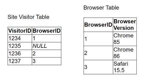
The client uses "Some Records Match" for the Referential Integrity setting because a match is not guaranteed. The client wants to improve the performance of
the dashboard while also getting an accurate count of site visitors.
Which modifications to the data tables and join should the consultant recommend?
To improve the performance of a Tableau dashboard while maintaining accurate counts, particularly when dealing with unknown or NULL BrowserIDs in the data tables, the following steps are recommended:
Modify the Browser Table: Add a new row to the Browser Table labeled 'Unknown,' assigning it a unique BrowserID, e.g., 0 or 4.
Update the Site Visitor Table: Replace all NULL BrowserID entries with the BrowserID assigned to the 'Unknown' entry. This ensures every record in the Site Visitor Table has a valid BrowserID that corresponds to an entry in the Browser Table.
Change Referential Integrity Setting: Change the Referential Integrity setting from 'Some Records Match' to 'All Records Match.' This change assumes all records in the primary table have corresponding records in the secondary table, which improves query performance by allowing Tableau to make optimizations based on this assumption.
Handling NULL Values: Replacing NULL values with a valid unknown option ensures that all data is included in the analysis, and integrity between tables is maintained, thereby optimizing the performance and accuracy of the dashboard.
A client needs to design row-level security (RLS) measures for their reports. The client does not currently have Tableau Data Management Add-on, and it
may be an option in the future.
What should the consultant recommend as the safest and easiest way to manage for the long term?
For implementing row-level security (RLS) without the Tableau Data Management Add-on, the best approach is to integrate user filters into the published data source:
Creating User Filters on Published Data Source: This method involves defining user filters that apply directly to the data source before it is published to the Tableau Server. This ensures that any workbook or view leveraging this data source inherently respects the row-level security settings.
To implement this, create a calculated field in Tableau that defines the security logic, typically using a formula that references user functions (like USERNAME() or ISMEMBEROF()). Drag this field to the Filters shelf and configure it to match the security rules (who can see what data).
Once configured, publish the data source to Tableau Server with these filters in place. This approach centralizes security management, making it easier to maintain and update security policies as they are applied universally to all workbooks using this data source.
This strategy is safe as it reduces the risk of accidental data exposure through individual workbook misconfiguration and simplifies long-term maintenance of security policies.
Reference This method follows Tableau's best practices for implementing row-level security as detailed in Tableau's security management resources. It ensures robust, maintainable security measures that scale with organizational needs without requiring additional add-ons.
An online sales company has a table data source that contains Order Date. Products ship on the first day of each month for all orders from the previous month.
The consultant needs to know the average number of days that a customer must wait before a product is shipped.
Which calculation should the consultant use?
The correct calculation to determine the average number of days a customer must wait before a product is shipped is to first find the shipping date, which is the first day of the following month after the order date. This is done using DATETRUNC('month', DATEADD('month', 1, [Order Date])). Then, the average difference in days between the order date and the shipping date is calculated using AVG(DATEDIFF('day', [Order Date], [Calc1])). This approach ensures that the average wait time is calculated in days, which is the most precise measure for this scenario.
To calculate the average waiting days from order placement to shipping, where shipping occurs on the first day of the following month:
Calculate Shipping Date (Calc1): Use the DATEADD function to add one month to the order date, then apply DATETRUNC to truncate this date to the first day of that month. This represents the shipping date for each order.
Calculate Average Wait Time (Calc2): Use DATEDIFF to calculate the difference in days between the original order date and the calculated shipping date (Calc1). Then, use AVG to average these differences across all orders, giving the average number of days customers wait before their products are shipped.
Date Functions in Tableau: Functions like DATEADD, DATETRUNC, and DATEDIFF are used to manipulate and calculate differences between dates, crucial for creating metrics that depend on time intervals, such as customer wait times in this scenario.
A company has a sales team that is segmented by territory. The team's manager wants to make sure each sales representative can see only data relevant to
that representative's territory in the team Sales Dashboard.
The team is large and has high turnover, and the manager wants the mechanism for restricting data access to be as automated as possible. However, the
team does not have a Tableau Data Management license.
What should the consultant recommend to meet the company's requirements?
To ensure that each sales representative sees only data relevant to their territory, the best approach in the absence of a Tableau Data Management license involves using a joined data source with entitlements:
Data Source Configuration: Create a data source that joins the sales data table with an entitlements table. The entitlements table contains mappings of sales representatives to their respective territories.
Data Source Filter: Implement a data source filter that restricts data based on the current user's access rights. This filter references the joined entitlements to dynamically control data visibility based on the logged-in user.
Publishing the Data Source: Publish this filtered data source to Tableau Server. All workbooks or dashboards connecting to this data source inherently respect the row-level security established by the data source filter.
Reference This approach aligns with Tableau's capabilities for implementing row-level security directly within the data source, as detailed in the Tableau security management and data modeling best practices.
A client is working in Tableau Prep and has a field named Orderld that is compiled by country, year, and an order number as shown in the following table.
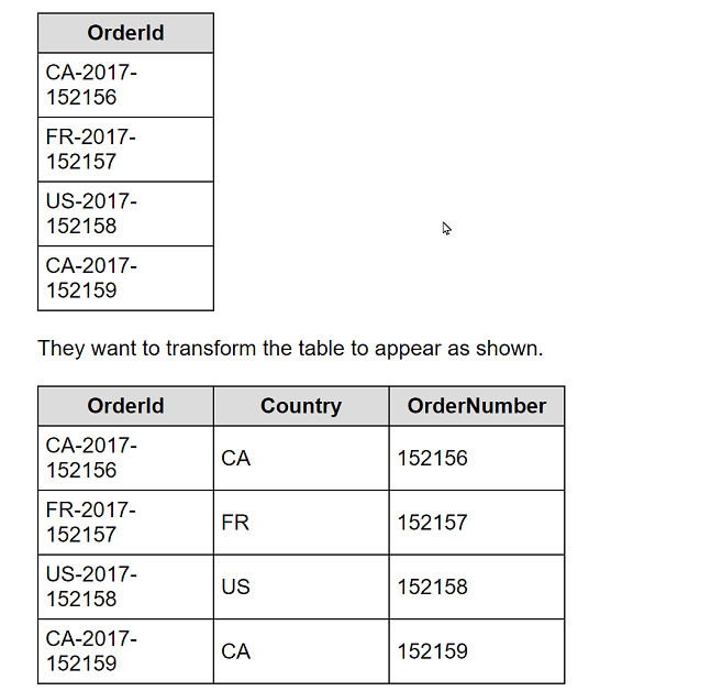
What should the consultant use to transform the table in the most efficient manner?
To transform the Orderld field in Tableau Prep, the Split option is the most efficient and straightforward method. Here's how you can apply it:
In Tableau Prep, drag your dataset into the flow.
Click on the Orderld field in the workspace to select it.
Look for the option in the toolbar that says 'Split' and select it.
Choose 'Automatic Split' if the delimiters (such as hyphens) are consistent; Tableau Prep should automatically detect the hyphen as the delimiter and split the Orderld into multiple new fields.
The dataset should now show new columns: one for the country code (CA, FR, US), one for the year (2017), and one for the order number (152156, 152157, etc.).
The Split option works effectively here because it automatically identifies and uses the hyphen as the delimiter to divide the original Orderld into the desired components without manual specification of conditions or writing any formulas.
Reference This procedure is based on the standard functionalities provided in Tableau Prep for splitting a field into multiple columns based on a delimiter, as described in the Tableau Prep user guide.