Free CompTIA DA0-001 Exam Actual Questions

The questions for DA0-001 were last updated On Apr 29, 2025

At ValidExamDumps, we consistently monitor updates to the CompTIA DA0-001 exam questions by CompTIA. Whenever our team identifies changes in the exam questions,exam objectives, exam focus areas or in exam requirements, We immediately update our exam questions for both PDF and online practice exams. This commitment ensures our customers always have access to the most current and accurate questions. By preparing with these actual questions, our customers can successfully pass the CompTIA Data+ Certification Exam exam on their first attempt without needing additional materials or study guides.

Other certification materials providers often include outdated or removed questions by CompTIA in their CompTIA DA0-001 exam. These outdated questions lead to customers failing their CompTIA Data+ Certification Exam exam. In contrast, we ensure our questions bank includes only precise and up-to-date questions, guaranteeing their presence in your actual exam. Our main priority is your success in the CompTIA DA0-001 exam, not profiting from selling obsolete exam questions in PDF or Online Practice Test.


Question No. 1

A data analyst is designing a dashboard that will provide a story of sales and determine which site is providing the highest sales volume per customer The analyst must choose an appropriate chart to include in the dashboard. The following data is available:

Which of the following types of charts should be considered?

Show Answer Hide Answer
Correct Answer: D

The best type of chart to display the data is D. Include a column chart using the site and sales to average sales per customer.

A column chart is a good choice for comparing categorical data with numerical data, such as the site and sales to average sales per customer. A column chart can show the relative differences between the sites and highlight the site with the highest sales volume per customer. A column chart can also be easily labeled and formatted to make the data clear and understandable.

A line chart is not suitable for this data, because it is used to show trends or changes over time, which is not relevant for the site and sales to average sales per customer data. A line chart would also be confusing and misleading, as it would imply a connection or correlation between the sites that does not exist.

A pie chart is also not a good choice for this data, because it is used to show the proportion of a whole, not the comparison of different categories. A pie chart would also be difficult to read and interpret, as it would require labels or legends to identify the sites and their sales to average sales per customer. A pie chart would also not be able to show the exact values of the sales to average sales per customer, only their relative sizes.

A scatter chart is another inappropriate option for this data, because it is used to show the relationship or correlation between two numerical variables, not between a categorical and a numerical variable. A scatter chart would also be cluttered and unclear, as it would plot each site as a point on a coordinate plane, without any labels or axes. A scatter chart would also not be able to show the differences or rankings between the sites and their sales to average sales per customer.


Question No. 2

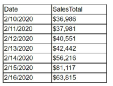
Given the following report:

Which of the following components need to be added to ensure the report is point-in-time and static? (Select two).

Show Answer Hide Answer
Correct Answer: D, F

To ensure that a report is point-in-time and static, it should include the date when the report was last accessed and the date on which the report was run. These components confirm the specific time frame the data represents, making the report a fixed reference that does not change with subsequent data updates or accesses. This is crucial for accurate historical analysis and for maintaining the integrity of the data as it was at the time of the report's creation.


Best practices in business reporting.

Importance of time-stamping in data analysis.

Guidelines for creating static reports in data analytics.

Question No. 3

The current date is July 14, 2020. A data analyst has been asked to create a report that shows the company's year-over-year Q2 2020 sales. Which of the following reports should the analyst compare?

Show Answer Hide Answer
Correct Answer: C

Year-over-year (YoY) comparison is a method of evaluating two or more measured events to compare the results at one period with those from a comparable period on an annual basis. For a year-over-year comparison of Q2 2020 sales, the analyst should compare the sales figures from Q2 2020 with those from Q2 2019. This comparison will show the growth, stagnation, or decline in sales over the year and is a common practice in financial analysis to assess performance.


SlideTeam's article on sales comparison templates1.

Salesforce help article on calculating YoY or Quarter-over-Quarter (QoQ) in reports2.

Smartsheet's content on annual sales report templates3.

TechRepublic article on creating a YoY comparison chart using a PivotChart in Excel4.

Question No. 4

Which of the following report types is most appropriate for a high-level, year-end report requested by a Chief Executive Officer?

Show Answer Hide Answer
Correct Answer: B

For a high-level, year-end report requested by a Chief Executive Officer (CEO), a recurring report type is most appropriate. Recurring reports are regular, scheduled reports that typically summarize information over a set period, such as a fiscal year. They provide a consistent format for executives to track performance over time, and their standardized nature makes them suitable for high-level analysis and decision-making. Since CEOs need to monitor performance and make strategic decisions, a recurring report that provides a comprehensive overview of the year's activities and outcomes would be valuable. This allows the CEO to evaluate the company's performance against its goals and objectives systematically.

Dynamic reports (A) are more interactive and typically used for in-depth analysis where users can drill down into the data. Ad hoc reports (C) are one-time, usually unscheduled reports tailored for specific questions, which may not be as comprehensive as a year-end report requires. Self-service reports (D) allow users to create their reports on demand, which may not be the formal, synthesized view a CEO would need for a year-end report.


Question No. 5

A data analyst has received a data set that contains actual and projected sales for the fourth quarter of 2019. Which of the following statistical methods should the analyst use to find the measure of dispersion?

Show Answer Hide Answer
Correct Answer: B

The measure of dispersion is used to describe the spread of data around a central value. In the context of a data set containing actual and projected sales, the measure of dispersion will help to understand the variability or consistency of sales figures. Thevarianceis themost appropriate statistical method for finding the measure of dispersion because it calculates the average of the squared differences from the Mean, providing a clear picture of data spread. It is especially useful in comparing the spread between different data sets and understanding the distribution of data points.

Meanis a measure of central tendency, not dispersion.

Correlationmeasures the relationship between two variables, not the spread of a single variable.

Confidence intervalsare used to estimate the range within which a population parameter will fall, but they do not measure dispersion within the data set itself.


Measures of Dispersion in Statistics1

Measures of Dispersion - Definition, Formulas, Examples2

Statistical dispersion - Wikipedia3